Landing pages for ecommerce are specific pages within a website designed to attract leads (potential customers) from various marketing channels, such as Google ads, newsletters, or social media links. The goal is to encourage these leads to take a specific action, whether it's making a purchase or registering. Unlike product pages or main ecommerce pages, which may have different objectives like informing visitors, distinguishing the brand, and selling, landing pages for ecommerce have a singular objective: prompting the user to take action.
If you have an online store, in this article, we will explain why it's interesting to develop your landing pages and provide key tips for making them successful. Are you ready?

Best Tips for Building Ecommerce Landing Pages
We recommend creating different landing pages for your various marketing campaigns, different customer segments you've identified, and different lead stages. However, all of them should possess the following characteristics to be truly effective and increase your conversion rates.
1. Focus On Meeting User Needs
What does a person interested in your product want to read? That's the first question you should address when designing your ecommerce landing page. For this tip, and the rest, putting yourself in the user's shoes will be helpful.
Content is the most important element of your landing page, so don't treat it lightly. Remember, online audiences have limited attention spans, so less is more. Short, direct, and simple sentences tend to work best. Writing more doesn't necessarily yield better results. Concentrate on being concise and delivering the content the consumer wants to read when they open a page like this.
2. Prioritize Organization
Similar to the content, the design and structure of the landing page should be straightforward. Today's users are time-pressed, and they won't give a brand more than one chance. If users feel overwhelmed upon entering a page or struggle to navigate, they're unlikely to take any action.
In this regard, ensure all your content (both text and visual) is well-organized and designed with a consistent style. Furthermore, the structure of your page should be intuitive, providing a positive user experience.
3. Highlight Product Benefits
What you must absolutely include in your landing page content are the advantages your product offers compared to the competition. However, merely listing benefits won't suffice; you need to explain them. As mentioned, the explanation doesn't have to be lengthy, but it should be clear and purposeful. If you only list the advantages of what you're offering, the consumer might not fully comprehend the actual value. Therefore, a brief explanation is crucial. For instance, saying that the product contains "high-quality natural ingredients" is different from explaining that "this way, your body will absorb them better and benefit from all their properties."
4. Address Key Questions
Every unanswered question a customer has is another reason they might not make a purchase on your store. Online selling has its advantages, but the physical distance between seller and buyer is not one of them. Unlike in a physical store where customers can easily ask professionals any questions they have, the digital world presents a challenge. However, this negative aspect can be overcome. In your ecommerce landing pages, you can also add a frequently asked questions (FAQ) section or gradually address potential questions within the different texts you include. You don't necessarily need to create a separate section for this purpose.
5. Incorporate Clear and Compelling CTAs
Call-to-action (CTA) buttons are one of the most characteristic elements of landing pages. These are very short words or phrases, typically found within a button, encouraging customers to take specific actions.
The first piece of advice we can offer regarding CTAs is to place them in various parts of the text, not just at the beginning, middle, or end, but all three. However, it's crucial that the CTA remains consistent. Changing it would distract the customer and potentially lead to confusion about which action to take. Offering only one option enhances the likelihood of a click.
Additionally, it's essential that the CTA button is attractive and attention-grabbing, ensuring it doesn't go unnoticed and is easily spotted by users.
6. Use High Quality Images Only
Visual content should play a prominent role in your landing page, as it shouldn't solely rely on text. Whether you include photographs or opt for design elements, everything you add should be of high quality. Otherwise, users won't have a favorable initial impression of your brand. They might think your business lacks seriousness, exhibits negligence, or lacks commitment, which can erode trust in your product.
You can even incorporate videos into your landing pages, as these types of resources make the user experience more engaging than relying solely on text.
It's also important that images, videos, and visual elements are perfectly adapted to all types of devices, especially mobile devices, which are the most commonly used for online shopping.
7. Create a Sense of Urgency
It's been proven that when users see a limited quantity of a product, one that can quickly sell out, or a limited time frame for purchasing, their likelihood of buying increases. You can capitalize on this by including different elements that create a sense of urgency in visitors. Here are a few ideas:
- Show users who are live-shopping or currently viewing a specific product.
- Alert visitors when only a few units of an item remain. This is commonly seen in clothing brands and marketplaces.
- Indicate that products are limited editions.
- Inform users when a specific offer has a set duration.
You can include all these notifications in your ecommerce landing page.
8. Show Real Experiences
We conclude our tips for creating successful landing pages with a very important element that also adds substantial value to your brand: success stories. Landing pages are an excellent place to include these stories, convincing the audience of your product's quality. You can include testimonials, before-and-after images, ratings on platforms, comments, and more. In fact, many companies ask their loyal customers to record a short video explaining why their experience was positive. If a customer is hesitating about trusting your product, these testimonials can be the push they need to make a decision.
Real Examples of Ecommerce Landing Pages
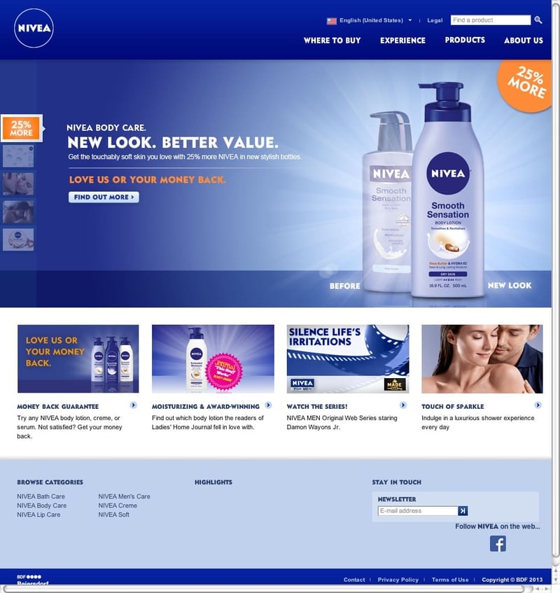
Nivea Promoting a New Product
Landing pages can be part of a new product launch strategy. In this example, skincare brand Nivea aimed to introduce its new packaging for three of its creams, which would now include larger quantities of product per item.
What we particularly like about this landing page is its design, consistently aligned with the brand's style while maintaining impact.
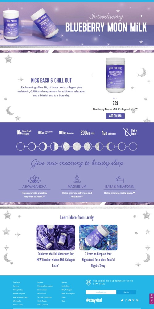
Vital Proteins Boosting a Product
You can also create landing pages for specific products you want to promote. We appreciate this example from supplement brand Vital Proteins because it incorporates nearly all the tips we've provided for creating a perfect ecommerce landing page: high-quality resources, clear CTAs, benefits explanation, organized content, and more.
La Roche-Posay's Effective CTAs
This is a clear example that you don't need to perform miracles to create a good CTA. The call to action on this landing page isn't particularly unique in terms of design or wording, but it works. And, ultimately, that's what matters.
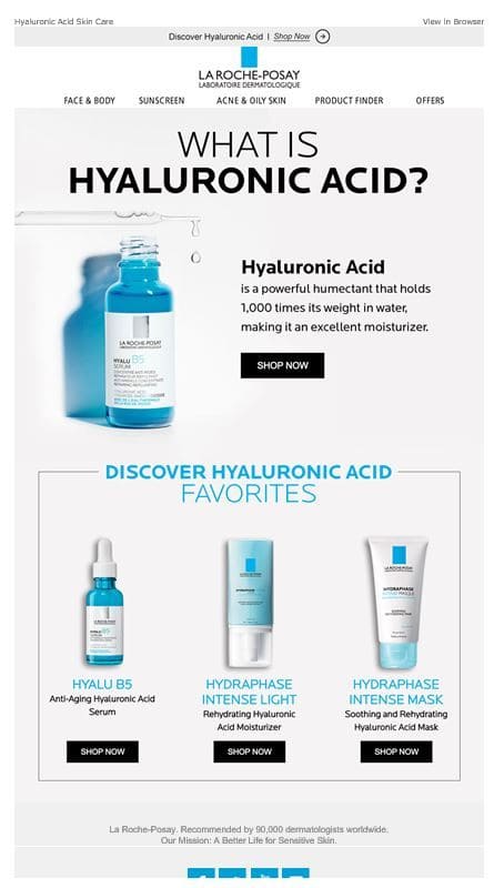
In this case, the use of contrasting colors grabs attention compared to the rest of the landing page, and the clear, concise wording guides the user to the desired action.

Tanit de Pouplana
Content & Marketing Strategist at Cyberclick. Passionate about communication and content creation. Tanit holds a degree in Journalism from the Autonomous University of Barcelona.

Leave your comment and join the conversation