Landing pages are a crucial element of inbound marketing. They determine whether or not a user will continue to navigate your website or leave immediately.
Although landing pages may seem simpler than other pages on your site, the truth is that they contain a lot of elements that should be strategically optimized to improve results. So let's look at the 15 keys to creating a perfect landing page that increases conversions.
15 Ways to Increase Conversion Rate With Your Landing Page
1. Your Title
Your title should attract the visitor's attention and convince them to keep reading. There are a few different formulas you can use to create interesting titles, like using a teaser or hook, word game, boast, say little or direct and with benefit.
These tips will help you to optimize your landing page’s title and increase the conversion rate:
- Leave space around the title to make it stand out.
- Use a suitable, legible and attention-grabbing font.
- Move the title out of the text alignment.
- Use the main keywords of the page in the title.
- Be relevant.
- Use powerful copywriting words like "free" or "new".
2. Have Compelling Copy
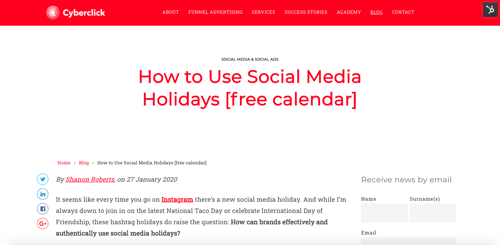
In the copy, or main text of the website, the key is in what you say and how you say it. Write down these guidelines to create effective copy:
- Pre-screen how users search for you in search engines and respond to their expectations. If a person comes to your website looking for certain keywords, they will expect to find them in your text, so make sure they’re visible and work as a claim.
- Scan your texts. Avoid excessive text blocks and use columns, bullet points, etc. to make reading easier and faster.
- Include things that both hemispheres of the brain like. The left side, which is more rational, needs to be given figures and reasons. The right side, more emotional, is convinced with creative and emotional messages.
- Write to be understood. Opt for simplicity and avoid clichés, trivia, and superlatives. Beware of being too witty, especially with critical elements of navigation.
- Establish a personal tone. Talk about yourself to users and show them that you know their circumstances as well as they do. Use personal phrases in a colloquial tone and tell stories that involve your product.
- Ask questions.
- Convey who you are in 7 seconds. Most opportunities to explain what you do won't go beyond that time, so be direct and explain your proposition simply, clearly and briefly.
- Explain the ROI. Talk about what the user will get in return for trusting you and make concrete and honest promises, for example "batteries that last 30% longer".
3. Sell an Image
The main image must convey your personality, be related to the message you want to convey, be consistent with your brand identity and with the rest of the elements of the website, and be able to illustrate and explain the text. Take a lot of care when choosing that selling image!
4. Use CTAs
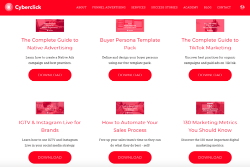
The call to action is the element of the website that asks the visitor to perform the action we are looking for, for example, downloading a content.
It is important that it is visible, clear and leaves no room for doubt. It must stand out visually from the rest of the information by means of the color, size, and location (without having to scroll).
The message displayed is also important: it must be simple, clear, striking and inspiring to perform the action. Try different types of copy to see which ones convert more.
Finally, we need to make sure that the CTAs are consistent, always using the same message, color and size throughout the page.
5. Create Forms
The form is an essential inbound marketing tool by which we capture visitor data. When creating a landing page, you must find a balance between capturing enough data to qualify a lead and making the form easy to fill out and not too invasive.
A very useful option to balance these two factors is the intelligent form, which is able to remember the data that a user has left in previous visits so that they do not ask the same questions twice.
6. What Are the Benefits?
One of the most important lessons of copy is that you have to sell profit, not functionality. Whoever buys a drill doesn't want a drill, he wants to make a hole in the wall. Therefore, focus your efforts on explaining how your product or service can benefit the potential customer.
7. Create a Sense of Urgency
A sense of urgency calls the user to take quick action. You can create an appropriate sense of urgency using these two tips:
- Don't make the user think about what action to take; make it clear to them and encourage them.
- Put "only until day X" countdowns to increase the conversion rate.
8. Offer Discounts
Discounts are another very common resource to motivate the user to click, especially if we combine them with the previous section and offer them only for a limited time.
Try out different types of discounts to see which ones are more motivating to click. For example, our tests show that discounts with monetary units (“$10 less” or “save $25”) work better than those expressed in percentages (“10% less”).
9. Credibility Is Key
94% of visitors reject a website or distrust it because of its appearance. Therefore, we must use design details that provide security and confidence to the visitors of our page. The battle for credibility begins with a design that denotes professionalism.
But of course, appearance is not everything. If you want to gain the trust of the users, never say you are the best if you do not have proof to corroborate it.
Nor should you hide problems or negative issues. Being transparent is a benefit, even in the most complicated moments. Users will value and appreciate it.
Finally, remember that you can use elements such as testimonials or trust marks to reinforce your credibility.
10. Pricing
Not showing the price at the landing can work if the objective is to maximize the number of leads to close the sale by other means, even if it means that the leads will be of lower quality.
If you decide to show it, there are two very simple tricks to increase the conversion rate:
- Show prices that seem cheaper, lik$499.
- Offer discounts next to the previous price ( now $97, before $150).

11. Color Palette
The color palette is an important element in creating a landing page. It has been proven that colors cause psychological and emotional effects on people.
When a user enters your website, the colors affect their perception of the brand. Too many bright colors can distract the user, while too many dark tones can bore them and keep them from going deeper into the site.
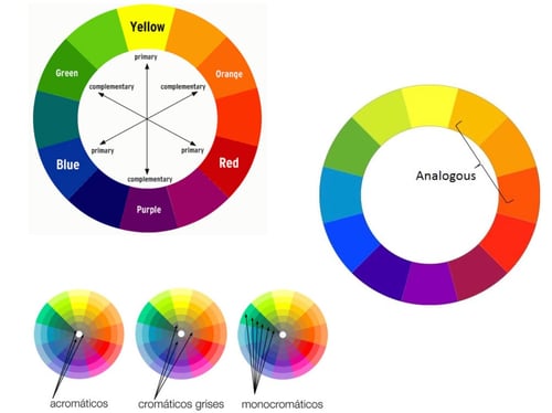
When planning your design, keep these color ranges in mind:
- Complementary colors are opposite to each other on the color wheel (e.g., yellow and violet).
- Analogous colors are neighbors on the color wheel (orange and red).
- Monochromatic colors are all the tints, shades, and hues of a particular color.
12. Typography
When choosing a typeface, you should prioritize a font that matches the aesthetics of the rest of your website or the brand's style guide, so that the user feels comfortable.
Never sacrifice legibility for a very elaborate or sophisticated font: the user will not interact with a page they cannot easily read.
13. Avoid Scrolling
Did you know only 76% of people use the scroll bar on a web page? Although they're the majority, that means almost one in four don't see the items below the fold.
The conclusion: when creating your landing page, place the most important information and the call to action in the top half of the page.
14. Add Value
To increase the conversion rate, the landing page must convey affinity with the user. It is therefore necessary to start with a complete study of the buyer persona and his needs.
Making your value proposal clear and adapting it to the profile of your audience will help users see your brand in a positive way and encourage them to interact with it.
15. Contact Information
Your landing pages should include your contact information and links to the rest of your website and other digital channels (for example, your social networking accounts).
This way, interested users can research your business and continue to interact with your content. So, even if you don't get a conversion immediately, there will be more chances of retaining them and they will end up becoming customers of the brand in the medium or long term.
CEO y cofundador de Cyberclick. Cuenta con más de 25 años de experiencia en el mundo online. Es ingeniero y cursó un programa de Entrepreneurship en MIT, Massachusetts Institute of Technology. En 2012 fue nombrado uno de los 20 emprendedores más influyentes en España, menores de 40 años, según la Global Entrepreneurship Week 2012 e IESE. Autor de "La empresa más feliz del mundo" y "Diario de un Millennial".
CEO and co-founder of Cyberclick. David Tomas has more than 25 years of experience in the online world. He is an engineer and completed an Entrepreneurship program at MIT, Massachusetts Institute of Technology. In 2012 he was named one of the 20 most influential entrepreneurs in Spain, under the age of 40, according to Global Entrepreneurship Week 2012 and IESE. Author of "The Happiest Company in the World" and "Diary of a Millennial".



Leave your comment and join the conversation